Why You Need This Checklist
What if you could make your website feel alive — not through a bloated JavaScript library or a complex SVG animation — but with a handful of CSS properties you can type out in minutes? Kevin Powell, one of the most trusted CSS educators on YouTube, stumbled onto something at CSS Day that made even him say out loud: 'I didn't realize this was possible.' And once you see it, you'll feel the same way.
Here's the problem most developers face: the web has gotten boring. Everything looks the same. Every button is a rounded rectangle, every hover state is a color shift, and AI-generated layouts are making it worse by the day. You know your sites could feel more delightful, but every time you try to add something creative, it turns into a rabbit hole of JavaScript, canvas APIs, or fragile SVG paths that break the moment your layout changes.
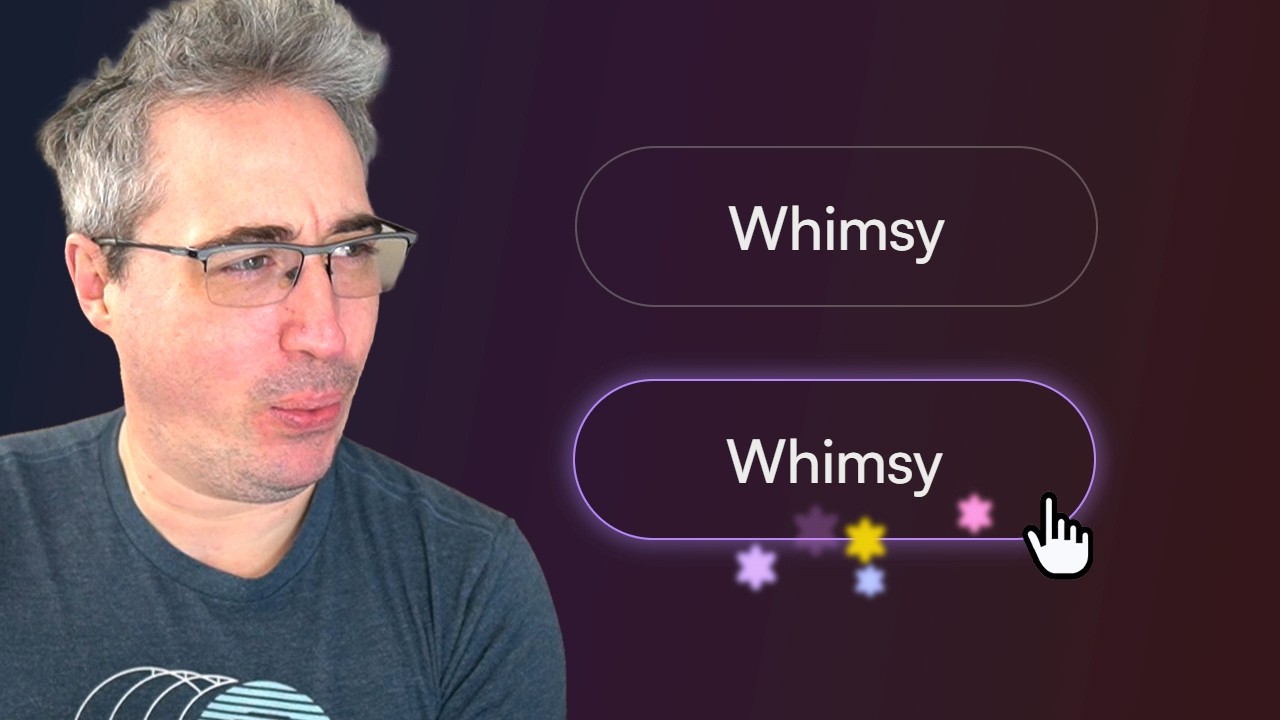
Now picture this instead. You hover over a button on your site and tiny glowing star-shaped orbs shoot out from the border, follow the curve of the button's border-radius perfectly, fade in as they launch, and then flicker out as they drift away. It looks like something from a premium product landing page. And you built it entirely in CSS — no libraries, no JavaScript, no SVG files. That's the power of the CSS offset-path property with border-box, and Kevin Powell's video breaks it down step by step.
Kevin has taught CSS to millions of developers, and his ability to take a spec-level feature and turn it into something immediately usable is what sets him apart. He discovered at CSS Day — through a talk by Eric Meyer — that offset-path doesn't require an SVG path at all. You can tell an element to travel along its parent's border-box with a single line. Kevin then builds on that foundation live on screen: adding offset-distance, offset-rotate, keyframe animations for opacity, custom properties for color and timing, blur filters for a glowing effect, and translate offsets so each star lands in a slightly different spot.
This checklist captures every actionable step from that video in the exact order Kevin builds the effect. Whether you're following along with the code or just want a reference to come back to, this PDF gives you the full blueprint — from the initial HTML structure through custom property setup, animation keyframes, and final polish.
Open it up, follow the steps, and add a little whimsy to your corner of the internet.
What's Inside — Preview
Every checklist item comes with actionable notes to guide you — things like "Don't forget to do this before you start," "Avoid this common mistake," or "Set a reminder for 30 days out." Nothing vague, just clear next steps.
BUILD
Set up the HTML button structure with a data attribute and decoration spans
DO
Apply base button styling and set a --main-color custom property on the button
DO
Add a pseudo-element for the glow/blur effect instead of animating box-shadow
DO
Style the .deco span with position: absolute to establish correct formatting context
DO
Add offset-path: border-box to the .deco element to attach it to the button's border
+ 20 more action items inside...
 ▶ Watch the source video on YouTube