Native CSS Popovers With Smooth Animations
Build animated, accessible popovers using only HTML and CSS — zero JavaScript required.
Based on: Native popovers with smooth animations (no JS required) by Kevin Powell
Build animated, accessible popovers using only HTML and CSS — zero JavaScript required.
Based on: Native popovers with smooth animations (no JS required) by Kevin Powell
What if you could build a fully accessible, beautifully animated popover without writing a single line of JavaScript? If that sounds too good to be true, you're probably still reaching for a JS library every time you need a tooltip or overlay — and that's costing you time, complexity, and bundle size you don't need to carry.
Here's the problem most developers run into: they either bolt on a heavy third-party solution just to show a little popover, or they hand-roll something that breaks keyboard navigation, ignores focus management, and looks janky on open and close. You end up with accessibility issues, z-index nightmares, and animations that only work in one direction. It's frustrating, and it feels like it should be simpler than this.
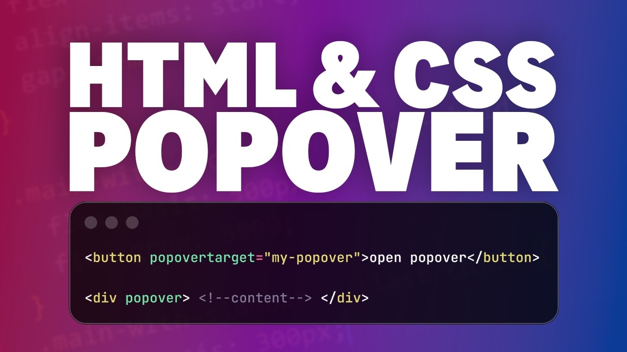
Imagine instead opening a polished, accessible popover that slides in smoothly when triggered, flips position automatically when it runs out of space, and fades out with a different animation on close — all with a handful of HTML attributes and a few CSS rules. No event listeners. No focus trapping logic. No z-index wars. The browser handles all of it natively, and your code stays clean and maintainable.
Kevin Powell — one of the most trusted CSS educators on YouTube, known for breaking down complex browser features into clear, practical lessons — walks through exactly how to build this from scratch. Kevin covers the native popover API, implicit anchor positioning, the new `@starting-style` rule for entry animations, `transition-behavior: allow-discrete` for animating display changes, and the `popover-open` pseudo-class for state-based styling. He even shows you the gotchas — like why putting `display: grid` in the wrong place breaks everything, and how to keep your grid styles intact during the closing transition.
This checklist distills every actionable step from Kevin's tutorial into a clean, structured reference you can follow build by build. Whether you're implementing your first native popover or refining an existing one, this PDF keeps you on track without rewinding the video. Follow the steps, avoid the mistakes Kevin flags, and ship a production-ready popover component that works beautifully across modern browsers — no JavaScript required.
Every checklist item comes with actionable notes to guide you — things like "Don't forget to do this before you start," "Avoid this common mistake," or "Set a reminder for 30 days out." Nothing vague, just clear next steps.
+ 21 more action items inside...
Instant PDF download. Start taking action today.
✓ Instant download · ✓ PDF format · ✓ No subscription